How to Create Hubspot Pop Ups to Generate Leads
Pop-up forms are usually seen as annoying and can bother people when they're on websites. But new studies show that if you use them in the right way, they can actually help get more people interested in your business and make them want to buy things. With HubSpot, you can use special pop-up forms to get people interested in what you're offering, which can lead to more sales and help you build relationships with customers over time.
But here's the truth: they're really good at getting people interested and turning them into potential customers, with a conversion rate of around 9.3%.
Now, let's explore how I created a pop up form to enhance lead generation
Start With Setting Up Your Callout
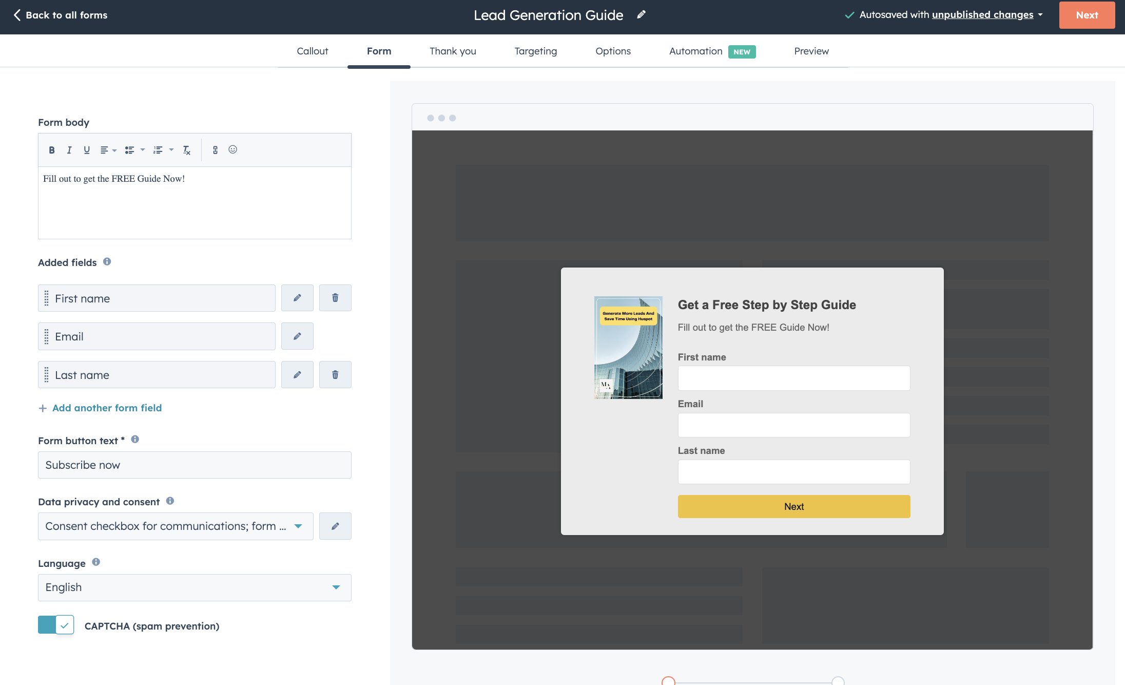
Callout Tab: I started by navigating to the Callout tab, where I could add and customize callout text to grab visitors' attention. This is where I made sure the text was compelling and engaging to encourage visitors to take action.
Customization Preview: As I made changes to the callout text, I could see a live preview on the right side of the screen. This helped me visualize how the pop-up form would appear to visitors once it's live on my page, ensuring that it looked appealing and professional.
Featured Image: Additionally, I had the option to add a featured image to the pop-up form to make it more visually appealing and impactful. This image could help reinforce the message and attract visitors' attention even further.
Main Header Text: I set the text for the main header of the pop-up form, making sure it was clear and concise. This header would be one of the first things visitors see, so it was important to make it compelling and relevant to encourage them to engage with the form.
Additional Body Information: Finally, I entered additional information for the body of the pop-up form. This could include more details about the offer or incentive, further explaining the value of taking action. It was essential to keep this information brief and focused to maintain visitors' interest and encourage them to complete the form.
Link Button: In crafting the link button, I opted for a vibrant color that instantly draws attention, ensuring it stands out amidst other elements on the webpage. Additionally, I carefully selected actionable text, such as "Get it Now," which encourages visitors to take immediate action by clicking on the button.

2. Create a Form
The next step was to add fields tailored to the information I needed, making sure not to exceed the maximum of four fields. I also activated the data privacy settings, including GDPR options, and personalized the default text to reflect my brand's tone. To enhance security, I enabled CAPTCHA to safeguard against spam submissions.
3. Thank you Page
After creating the form, I proceeded to configure the thank-you message, which is the message displayed to visitors after they submit the form. I customized this message to provide a personalized touch. Additionally, I had the option to redirect visitors to a specific webpage, blog post, meeting link, or calendar event after form submission, enhancing their user experience and engagement with my content.

4. Targeting
With HubSpot forms, I had the freedom to target exactly where and when my pop-up appeared. By setting triggers based on user behavior, I ensured that my engagement opportunities were optimized for maximum effectiveness.

5. Options
On the options page for HubSpot pop-ups, I can manage settings like lifecycle stages and screen size responsiveness. This allows me to disable pop-ups on smaller screen sizes, ensuring a smooth browsing experience for all visitors.

6. Automations
In the automation tab, I can set up smart rules for my pop-up forms. This means I can make them show up or do certain things automatically based on what visitors do on my website. This includes setting up automated workflows triggered by specific actions taken by visitors, such as form submissions or page views

Example
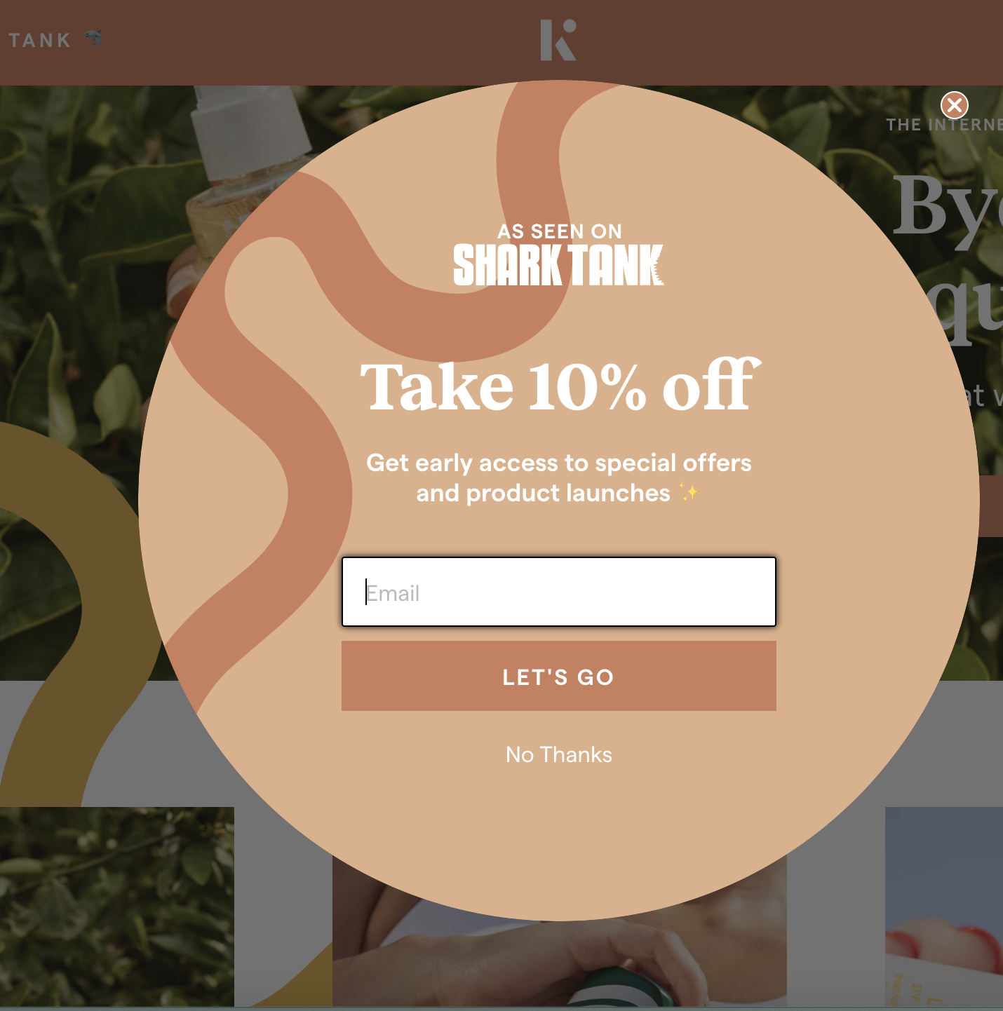
Kinfield - Lets see how Kinfield is using pop up forms to capture new leads.
Kinfield's tactic of using different shape for pop-ups grabs attention quickly. Offering a $10 discount in exchange for just an email makes subscribing easy.
Then, they sweeten the deal with a 15% discount if you provide your phone number. This strategy not only collects valuable information but also provides added value to new customers. Plus, having both email addresses and phone numbers opens up more avenues for marketing the product.


When you visit Glossier's website and begin scrolling, you'll notice that their pop-up appears halfway down the page. This timing is intentional, as it allows users to engage with the content before presenting them with an offer. The message "You Deserve It" intrigues visitors, inviting them to explore further without being overly pushy.

What sets Glossier's pop-ups apart is their approach to opt-ins. Instead of immediately bombarding users with an offer, they provide the option to either view the offer or continue browsing. This less intrusive method ensures that only those genuinely interested will proceed, leading to higher-quality leads.

Upon clicking to view the offer, users are presented with a straightforward prompt offering a 15% discount. The design remains consistent with Glossier's elegant branding, keeping the pop-up visually appealing and on-brand. Users are then given the choice to claim the discount or decline with a simple "No Thanks" option.
By following this strategy, Glossier not only captures leads effectively but also maintains a positive user experience

Want more leads? Let's create forms that save time and bring in new customers.