Building a High-Converting Landing Page With Hubspot
Did you know that 68% of businesses use landing pages to generate leads? With such a significant percentage of businesses recognizing the importance of these pages, it begs the question: How do you ensure your landing page stands out and convinces visitors to take action?
The answer lies in crafting a compelling design that resonates with your audience and effectively communicates your value proposition
What a Landing Page is?
The landing page serves as a dedicated platform designed to capture visitor information, such as email addresses or contact details. Unlike other pages on your website, landing pages are purpose-built to achieve a specific goal, whether it's promoting a webinar, offering a free ebook, or encouraging product sign-ups.
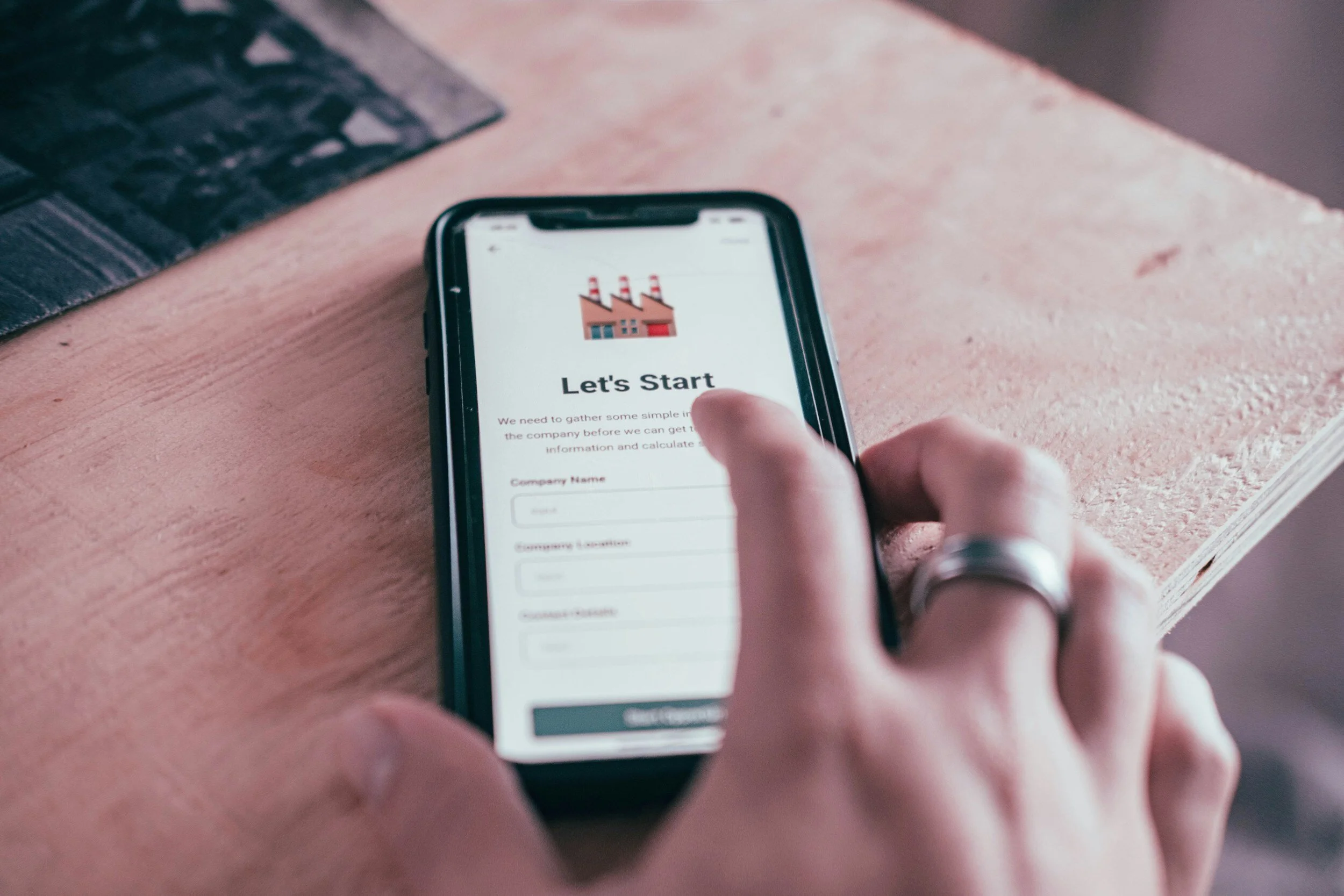
Building Your Landing Page
HubSpot's drag-and-drop editor simplifies the process of building a landing page, allowing you to customize layouts, add compelling visuals, and incorporate persuasive copy without any coding expertise. Whether you're starting from scratch or leveraging pre-designed templates, HubSpot offers flexibility and creative freedom to bring your vision to life.
What To Include?
When it comes to building a high-converting landing page, several key elements can make all the difference in driving engagement and conversions.
Compelling Call-to-Action (CTA): Your CTA is the gateway to conversion. It should be clear, concise, and action-oriented, prompting visitors to take the desired action, whether it's signing up for a webinar, downloading an ebook, or requesting a demo.
Unique Selling Proposition (USP): Your USP is what sets your product or service apart from the competition. It should clearly communicate the value proposition and benefits of choosing your offering over alternatives. Use compelling language to highlight what makes your solution unique and why visitors should choose you.
Hero Shot: A visually appealing hero shot or image can capture attention and convey the essence of your offering at a glance. Whether it's a product image, a snapshot of your software interface, or a captivating photo, ensure that it reinforces your USP and resonates with your target audience.
Compelling Text: The text on your landing page should be concise, persuasive, and focused on addressing visitor pain points and desires. Use persuasive copywriting techniques to highlight the benefits of your offering, address objections, and create a sense of urgency or FOMO (fear of missing out).
Sing up Landing Pages Examples
Nauto is a leading data platform specifically tailored for self-driving cars, dedicated to enhancing safety for companies managing fleets of autonomous vehicles through cutting-edge technology and insights
Nauto's landing page inspires with its thoughtful design choices. The simplicity of the layout immediately draws you in, from the impactful headline copy to the meticulously chosen featured image.
Captivating Top Image: The top image is undeniably captivating, seamlessly blending with the business's brand identity to grab visitors' attention right away.
Streamlined Form Design: The form design follows suit, with a streamlined layout that ensures a seamless user experience. Visitors can effortlessly input their information without encountering any obstacles, reflecting the company's commitment to user-friendly design.
However, it's worth noting that while longer forms may be effective for capturing detailed information, they could potentially deter new visitors. Streamlining the form further could enhance the overall user experience and encourage higher conversion rates.
Strategic Call-to-Action: The green "Submit" button serves as a clear call-to-action, guiding visitors towards completing the form and converting them into leads. The choice of color, green, may have been intentional to evoke a sense of progress or action.


2. Shopify
Shopify is a leading e-commerce platform that simplifies online store creation and management for businesses of all sizes.
Value Proposition
The landing page is carefully crafted to communicate Shopify value proposition from the get-go. Visitors understand immediately what Shopify offers: customizable templates and an all-in-one platform for bringing their ideas to life. The headline, "Bring your ideas to life for £1," positioned prominently at the top, presents an enticing offer that captures attention and encourages action.
Compelling Call to Action
One of the key elements that make the trial page effective is its simplicity. Shopify requires only an email address to start a free trial, making it incredibly easy for new customers to sign up. Furthermore, the absence of a requirement for credit card information removes barriers to entry and instills confidence in potential users.


Shopify strategically incorporates customer testimonials to showcase its value proposition. By featuring testimonials such as "Shopify is better than any other platform," the landing page builds trust and credibility with visitors, reinforcing the platform's superiority in the market.
To provide further clarity and address potential questions or concerns, Shopify includes a top FAQ section at the end of the landing page. Simple graphics and concise paragraphs ensure that information is easily digestible, while a concise call-to-action emphasizes the minimal effort required to get started.
By incorporating these elements into your landing page design, you can create a compelling user experience that drives engagement and conversions. Remember to test and iterate on your landing page design to optimize performance over time.